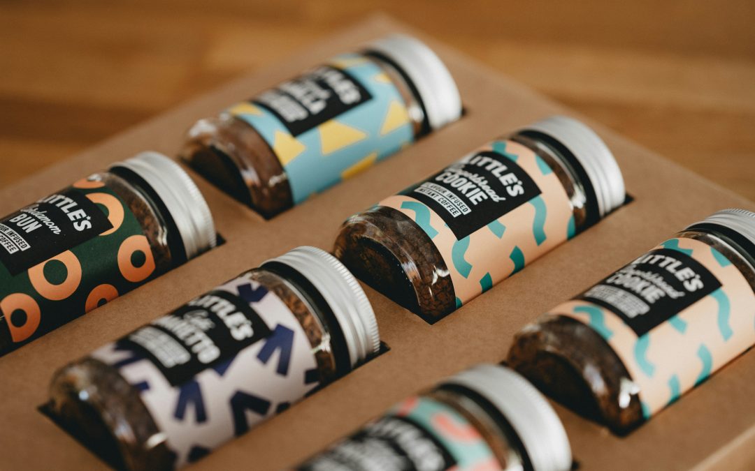
Your label may be designed by Banksy but if the customer isn’t captivated by it, then it isn’t doing its job. And remember it must fit your packaging perfectly too. Good label design includes the right blend of functionality, marketing design and product information. Read on to learn about how to bring all these elements together in your label design, so that your product stands out on the shelf.
-
Label Design Involves Some Serious Reflection
You need to reflect on what you want your label to say, not just in terms of words but colors and pictures too. Start by defining who your target audience is. This will form the basis of your entire label design process. For example, a lip gloss for tweens will have different shapes and colors than one meant for mature women. Similarly, the messaging on your product will vary depending on who your audience is.
-
The Right Size and Shape for the Label
Before you start picking colors, and all the fun stuff – you need to figure out how your label is going to fit on your product packaging and the materials you are going to use. Roping your label printing equipment supplier in right at the beginning of your label design process is a great idea. They’ll be able to guide on materials, their performance, and costs so you don’t have any nasty surprises later. For example, you’ll be able to compare what machine you’ll need to have a wrap around label, if you have a jar as your packaging or whether you’re better off having two labels – one at the front and one at the back. Or what materials will work best depending on how your product needs to be stored.
You can also consider a custom label shape to really make your product stand out on the shelf. Your label machinery manufacturer will be able to tell you how feasible it is.
-
The Layout
Now that you know how much space you have and what information you want to convey, you can start planning the layout of your label. Awesome label design is informative but isn’t stuffed with text, so customers aren’t overwhelmed. You can start planning on where to place your brand logo, the name of the product and ingredient or product information.
-
Graphics, Images, and Colors
High-quality graphics, colors, and images are what will grab your customers’ attention before anything else. Consider the overall aesthetic you’re going for — whether it’s minimalist, vintage, or modern while designing your graphics. Colors evoke emotions and create a mood for your product – yellow is inspirational, while green can mean eco-friendly, while black simply oozes elegance. It’s also important to make sure that the colors you choose stand out from your packaging or merge seamlessly with them.
A label is instantly recognizable if it aligns with your brand’s advertising and in-store displays. Forbes reports that presenting your brand consistently across different platforms increases revenue up to 23%!
-
The Text
You only have limited space on your label, and a lot of information to convey. The front of your label is where you can create buzz. A great label uses this space to tell your brand’s story and include a couple of your product’s benefits that will pique a customer’s interest. In the same report, Forbes mentions that ‘64 percent of consumers say that shared values help them create a trusted relationship with a brand.’, so make sure you let customers know you care!
While you’ve put a lot of thought into formulating your product, you need to make sure it isn’t let down at the final stage by poor label design. Getting your labeling machine provider involved right at the beginning can help you avoid many pitfalls.
Streamline your labeling processes and make the most of your label’s real estate with customized labeling machines from Accent Label Automation.
Talk to us today for a consultation and learn how we can help!

